2017
You are now looking at a vector version of the site with adaptive web design.
September 13, 2018
You are now looking at a vector version of the site with adaptive web design.

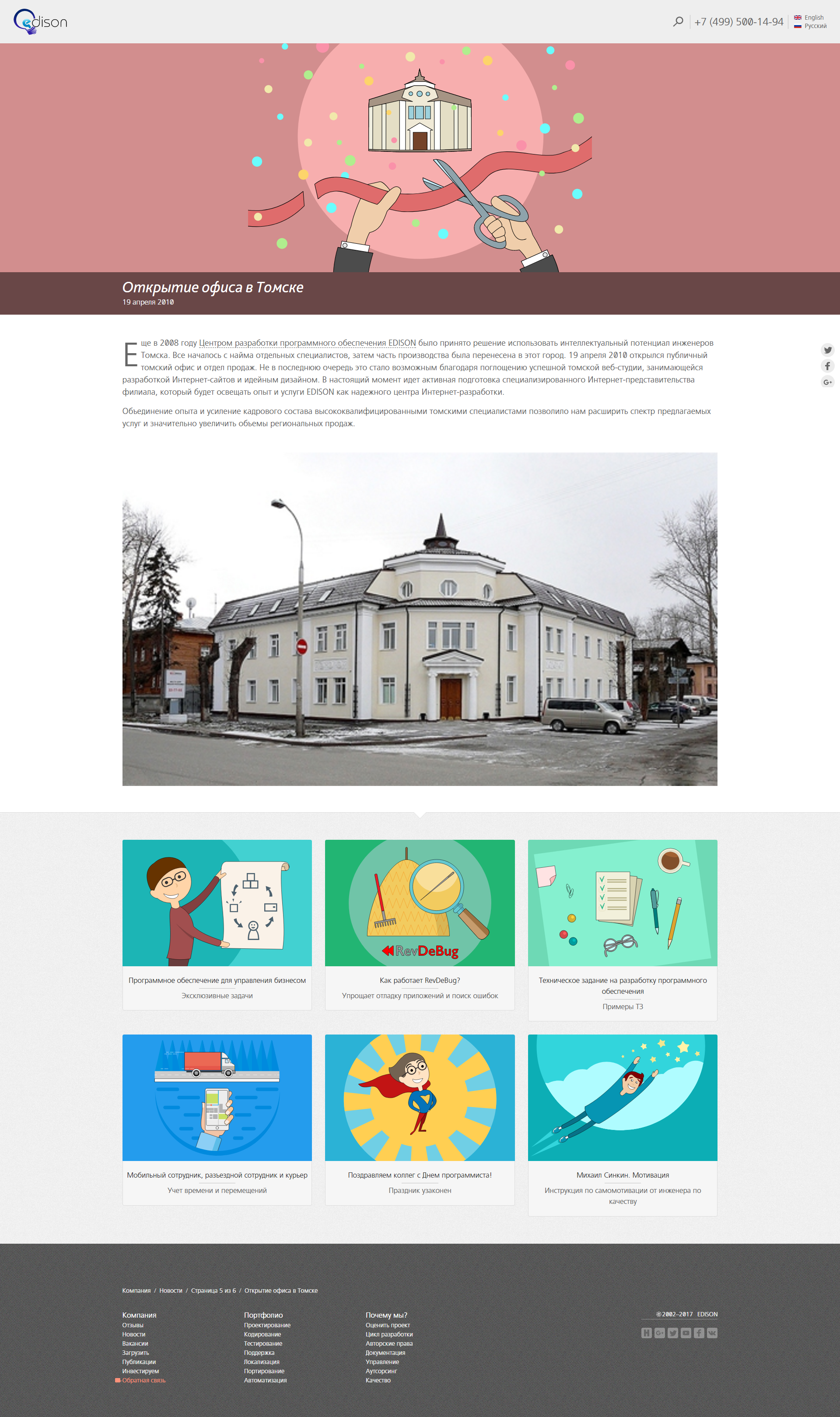
For seven years the site underwent a process of refinement: content was added, search engine optimisation was carried out, icons were drawn, the web design was changed, banners were updated, the homepage layout was improved, and a blog and portfolio were created.
That is an example of a website that is no longer online but seemed innovational at the time of its creation. It consequently turned out that the idea was a little outdated. This can happen with any website. Sites need to be updated from time to time to attract visitors back. However, some elements can be recycled and used again.
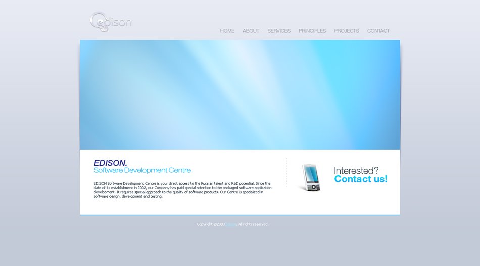
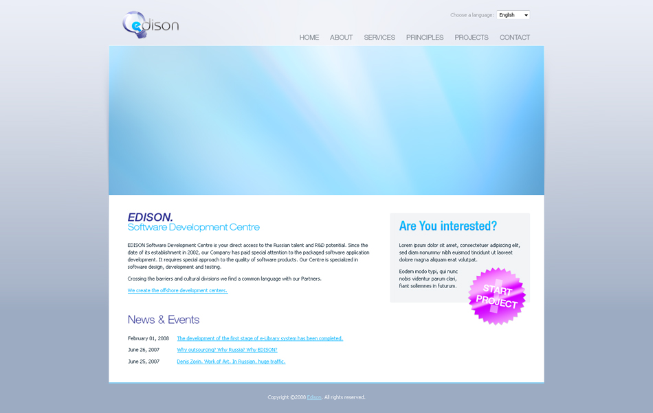
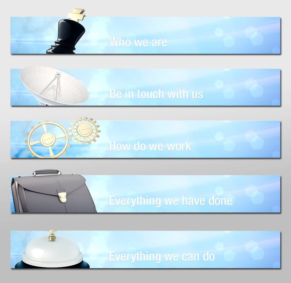
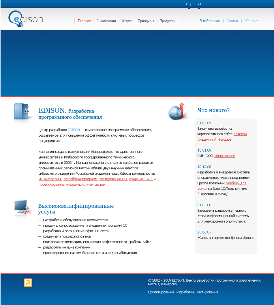
One of the prerequisites for this project was to retain one style throughout the site. The banner consisted of a colourful blue, turquoise and pink background with icons representing the main sections of the site and with descriptions in English.
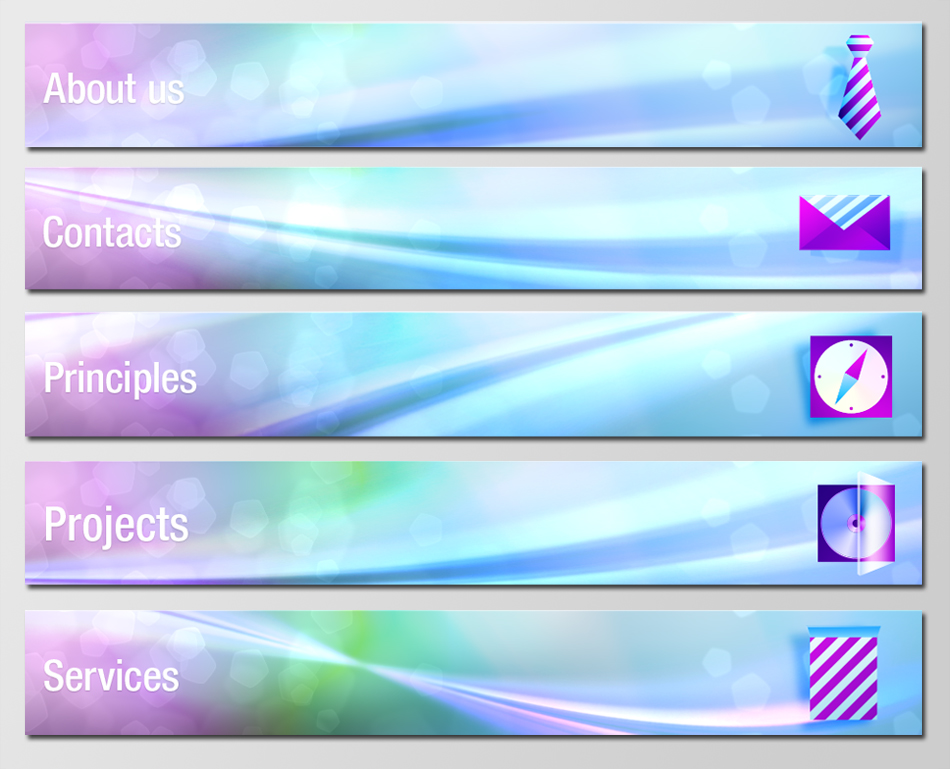
You should update your websites from time to time. A good site changes its graphics at least once or twice a year. You can sometimes change separate parts of a site, like banners. We regularly update the design of our banners and our website continues to attract interest from visitors because it looks fresh and new.
Development of a series of icons against a blue background with a colour gradient. Each icon depicts origami or other similar paper figures. The objects are coloured in a psychedelic rainbow with a play of colour shades.
The site was intended to be a graphic portfolio, which is why a wide layout was chosen. Later on, the design, fonts and some graphic elements were used in the vector version of the site.
Designed a specialised internet-office for the company's branch with the aim of sharing experience, offering services and promoting EDISON as a reliable web-development centre. A team of 10 different specialists worked together on this website: an art-director, a graphic designer, a page-maker, a technical designer, a flash-animator, a web-programmer, a copywriter, a proofreader, a content manager and a tester.
Drawing in the graphic style of the ZX Spectrum from the early 90s.
This version of the site wasn't published – it was rejected at the final stage.
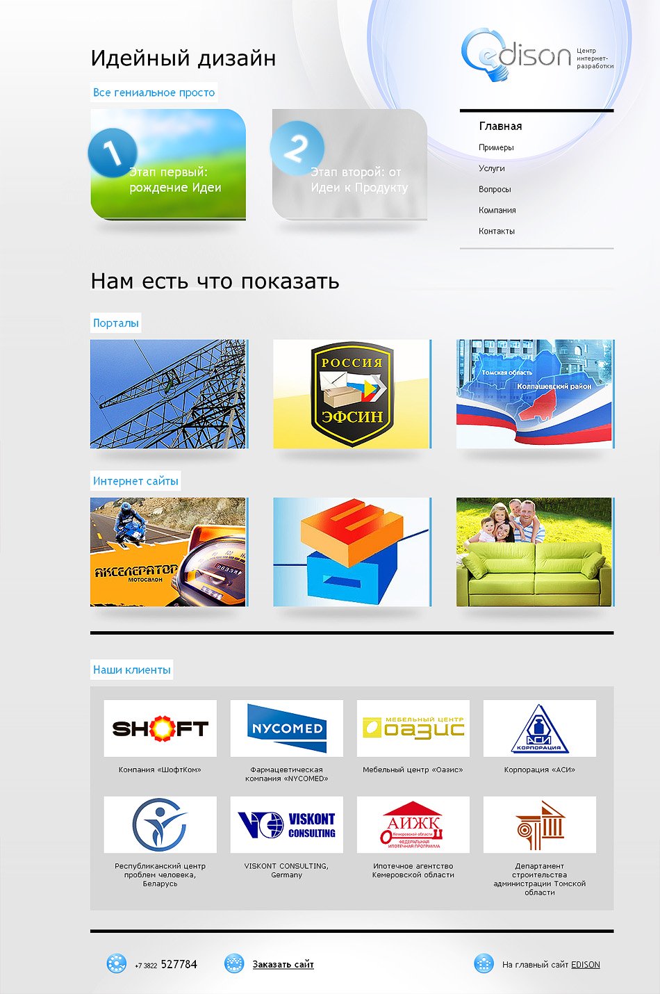
This is another sketch for our own website. The project included theme icons designed for the homepage and banners. These icons symbolise the site's sub-sections and are logically connected with them. All versions of the website designed by us have one thing in common: they use shades of blue and our corporate logo.
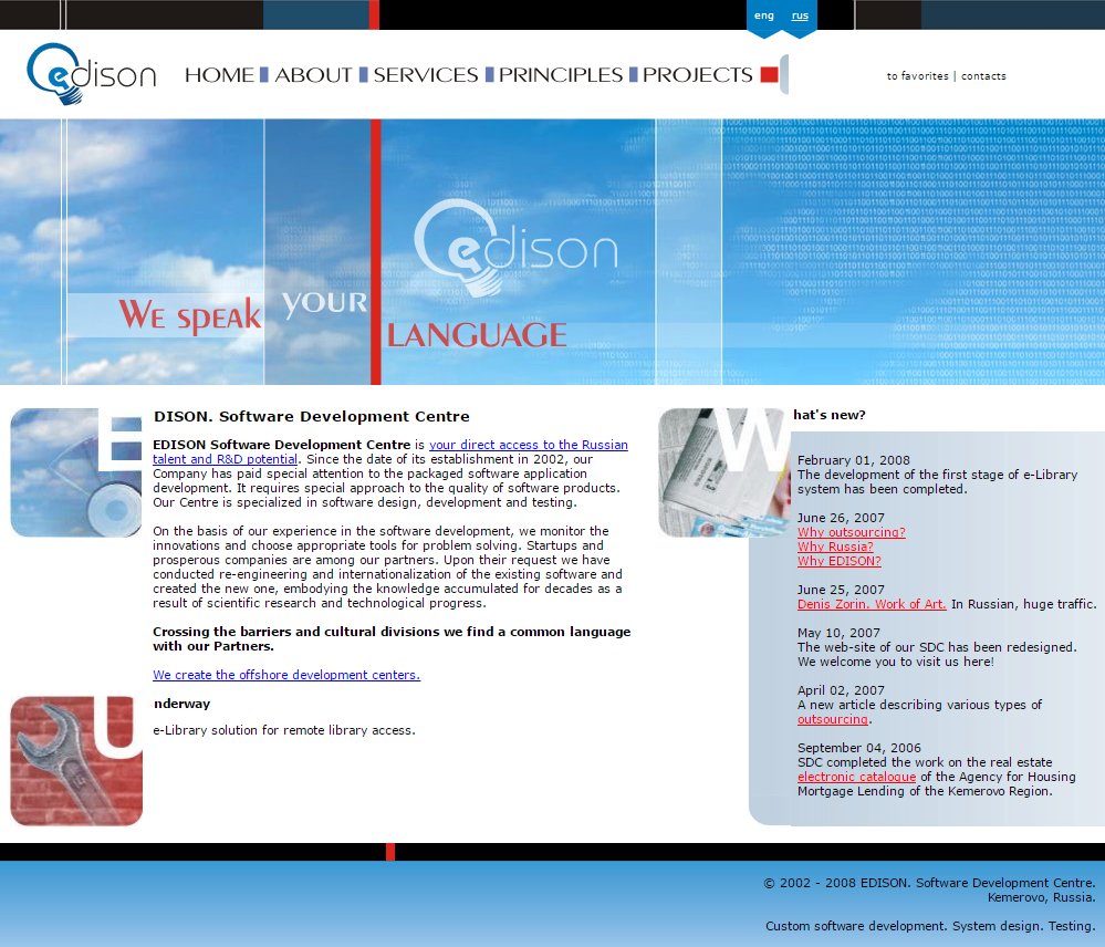
An English version of the site was made available. A team of highly qualified translators worked on the translation of the site content. Final corrections of the texts were made by a native English speaker.
Launching the English version of the site makes it possible for international partners to keep up to date with the company and find out about significant events, receiving information in the language of international communication. It's not a secret that our programmers have long since attracted the attention of companies from Europe, Australia and North America. Top-level professionalism and relatively low man-hour costs explain the competitiveness of our engineers on the global market.
Flash-animation created in accordance with the preexisting website design. The animation embodies the company's general working principles and the way we position ourselves on the market.
We created a video slogan and scenario in English, rendered the characters and did all of the animation in accordance with the scenario. The slogan was a product of logical reasoning and was connected with company principles and working style. A native English speaker examined the concept, video and slogan to make sure they were understandable, clear and cross-culturally acceptable.
– I want to discuss the flash movie.
WISDOM QUALITY AGILITY FORMALIZATION CUSTOMIZATION
WISDOM.
We imply more than just some kind of knowledge here. It is about truly confirmed long term experience in our sphere. I want to emphasize many man-years of experience. And tens of projects that were both successful and unsuccessful. The word wisdom is shown with the checkmate queen, king's counselor etc who is the person of a great wisdom. Do you think it is possible to express my opinion this way?AGILITY.
AGILE is an existing software programming technology. We assert that we do things fast, easily and quickly. I use nouns at the movie. AGILITY means what I want and AGILITY is consonant to AGILE. Is it possible to say in this way? What do you think about the movie in general?– Right, now I understand the context. These words make sense in the way you explained them to me but still sound strange in English here. I would use something like ‘(Proven) Knowledge’ instead of ‘Wisdom’ (the associations of this word are with wise old men with long beards…like from the bible…too high-flown for this situation). I'd also change ‘Agility’ to something like ‘Flexibility’ – agility is a physical characteristic of sportsmen and so doesn't fit very well here. The final decision is yours, of course. In general, I like the flash vid – simple and effective. It clearly shows your message.